Two tools, one workflow.
The Responsive Preview tool gives you three live iframes side by side with synced scrolling when same-origin — paste any URL and interact with all three at once. The /responsive-preview Cursor command adds an AI layer: it takes screenshots at all three viewports, reports layout issues, and links back to the live viewer.
Use them together: the viewer to spot issues visually, the command to get a structured pass/warn/fail audit and ask Claude to fix what's broken.
Paste a URL and compare three widths.
Open tinydesignshop.com/tools/responsive-preview, paste your URL, and click Preview. Three iframes load — Mobile at 390px, Tablet at 820px, Desktop at 1280px.
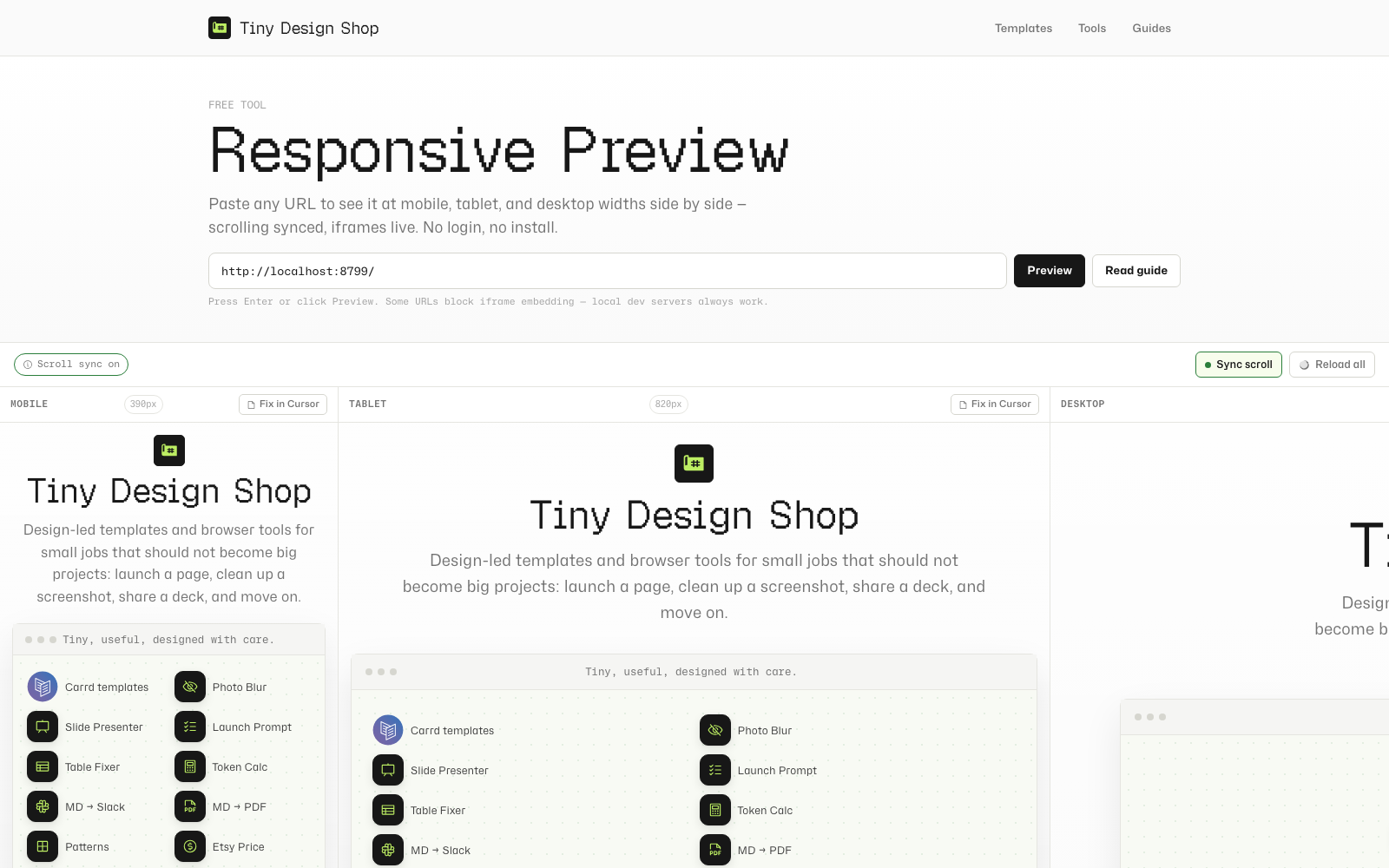
Synced scrolling works when the viewer and target URL are same-origin (for example, local viewer at localhost:8787 previewing localhost:8787/tools/my-page). When you scroll one frame, the others follow. Cross-origin previews still render — sync is unavailable and the toolbar chip says so.
Reload all (or press R) refreshes all three frames at once — useful after saving a code change.
Bookmark or share a direct link: clicking Preview updates the address bar with a ?url= parameter you can copy.

The /responsive-preview slash command.
This is a Cursor slash command — a markdown file that instructs Claude to run a responsive audit when you type /responsive-preview in chat.
Setup (one time)
- Open the Responsive Preview Cursor Command tool and download or copy the command file
- Copy it into your project's
.cursor/commands/folder (create the folder if it doesn't exist) - Start your local dev server (
npm run dev:html-presenterfromsite/for this repo) - Type
/responsive-previewin any Cursor chat
What it does
Claude takes screenshots at Mobile (390px), Tablet (820px), and Desktop (1280px) using the Claude Preview MCP. Then it runs a structured check across five dimensions — overflow, nav collapse, text legibility, image sizing, and fixed elements — and gives each viewport a pass, warn, or fail. It ends with links to open the live side-by-side viewer at your URL.
Preview a specific page
Pass a path as an argument: /responsive-preview tools/my-tool previews localhost:8787/tools/my-tool. No argument defaults to the root.
Using Fix in Cursor with Design Mode.
Each frame in the viewer has a Fix in Cursor button. Click it to copy a structured context block to your clipboard:
[Responsive issue at Mobile · 390px]
Page: http://localhost:8787/tools/my-tool
Viewport: 390px
---
Describe the issue here, then use Cursor Design Mode to annotate the element.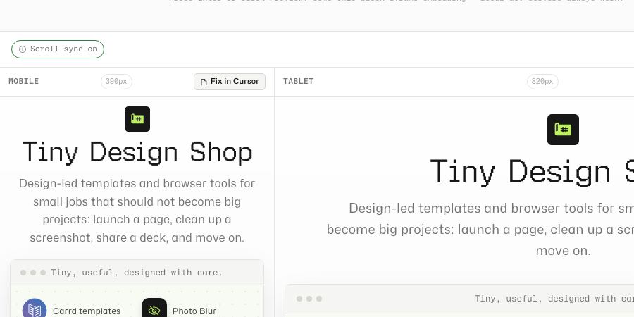
Paste this into Cursor chat. Then switch to Cursor's built-in browser, navigate to the same page, and use Design Mode — point to click an element, draw to highlight a region, or narrate to describe the change. Cursor captures the element's xpath, computed styles, and a screenshot, and sends it to Claude alongside your pasted context.
Blank frames, sync limits, and shareable links.
- Iframe blocked: Many sites set
X-Frame-OptionsorContent-Security-Policy: frame-ancestorsthat block embedding. Google, Twitter, and most logged-in SaaS apps block it. Local dev servers always work. For external sites, use/responsive-previewfor AI screenshots instead. - Scroll sync unavailable: Cross-origin loads (for example, production viewer + localhost target) still render but cannot inject the scroll relay script. Use the local viewer at
localhost:8787/tools/responsive-previewwhen developing locally. - Fix in Cursor: Click the button under the frame with the issue. Paste the copied block into chat, then annotate with Design Mode so the agent knows which element to fix.
- Shareable preview links: After you click Preview, the page URL includes
?url=— copy it from the address bar to bookmark or share. - Privacy: The URL you enter loads directly in your browser's iframes. Nothing passes through a TDS server.
Browser-local viewer, local MCP audit.
The viewer loads URLs directly into your browser's iframes — nothing passes through a TDS server. Scroll sync runs entirely in JavaScript on the page. The /responsive-preview command runs locally via the Claude Preview MCP in your Cursor session.